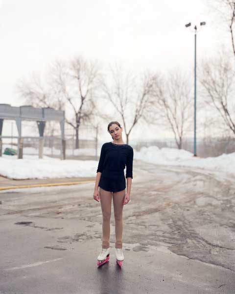
Sunday, 4 January 2015

Exhibition Review


Exhibition Review

On Wednesday 10th December students from Preston's College held a photography exhibition in the Victoria Building at UCLAN between 4pm - 6pm. Although the exhibition started just a little later than 4pm due to the preparation, it was very successful and there was a good turnout. The exhibition was named ‘Perspectives’ and I think it was named this because all the photographs were of the same model but she was being portrayed in different lights in every individual photo. There was around 30 students involved in the exhibition, all Preston’s College students I believe. Based on the quality of the work, I was very impressed that the photographs were produced by college students. Every person involved in the exhibition had worked extremely hard and that was very clear from the results of their photographs but the layout of the photographs was also very well thought out and it looked very professional. It was clear that everybody had worked together to ensure the photographs complimented each other and fitted in, rather than putting all the coloured ones together, they were spread out so there was variety and each set of photographs showed very different ‘perspectives’. As I was walking around the corridors of the exhibition, there were a certain few photographs which captured my eye.

The first was by a student named Stefan Eccles. Mr Eccles photograph intrigued me, this was because it was black and white and that captured my eye as it was different than many of the other photographs. The model in Mr Eccles photograph also had mascara running from either eye which makes your mind wonder as to why she appears to have been crying, had something happened or is this supposed to portray something much more deep and upsetting? There was many thoughts running through my head when I saw the photograph and that’s what intrigued me because there’s so much it could mean and you want to know more about her and why she appears the way she does in the photograph.

The second photograph that caught my eye was one by Hannah Wright, it was on the first wall as I walked into the exhibition and it was next to two completely different photographs, one with a bright coloured background and one with a dark background and the model with an unhappy expression on her face, Miss Wrights photograph was different from all the others as she had gotten the model to lie down which I think, drew attention to the photograph because of that, it was also black and white. The model in the photograph was led on her back and holding her right hand to her head, I think the image was really interesting and it sparked a lot of curiosity, mainly wondering why she chose the model to be positioned like that but also, wondering what she’s thinking about in the photograph, there’s so many things it could be representing and that’s what I like about it, it keeps you guessing and it’s intriguing. 
All of the photographs throughout the entire exhibition were all different and intriguing, they were all very well thought out and positioned which shows everybody involved worked well together and it was taken very seriously. The result was impressive and very professional.

Overall, I think the exhibition was a success and the work was fantastic for college students. The prints were of high standard and the photographs were all different but impressive in their own ways. All of the students seemed to be involved and were more than happy to answer any questions asked of them. There was a lot of professional shown throughout the whole exhibition.

Contact Sheets


Friday, 2 January 2015

Artist Research

Anders Petersen
Anders Petersen is a swedish photographer born in 1944 in Stockholm known for his documentary style black and white photography. In 1967 he started photographing in a bar called Cafe Lehmitz in Hamburg and continued with this for 3 years and in 1970 he had his first solo exhibition. In 1973 he published his first book "Gröna Lund" based on people in an amusement park in Stockholm. Then in 1984 his first book from a trilogy was published, they were based on people in nursing homes, prison and a mental hospital. 


Diane Arbus
Diane Arbus was an American photographer, focusing mainly on 'deviant and marginal' people. Including dwarfs, giants, transgender people, nudists and circus performers, people that could be considered as 'out of the ordinary'. Arbus said that a camera could be 'a little cold and a little harsh' but that it showed the difference between what people wanted to see and what they really saw. She was known as the photographer of freaks. In 1972, Arbus became the first American photographer to have their work shown at the Venice Biennale. After the second world war, Diane and Allan Arbus started a commercial photography business named 'Diane & Allan Arbus'. Diane was the director and Allan the photographer, their photos featured in Glamour, Seventeen, Vogue and Harper's Bazaar.


Rineke Dijkstra
Rineke Dijkstra is a Dutch Photographer, she lives and works in Amsterdam. Dijkstra worked as a formal portrait photographer until the early 1990's, when she began taking her own style of portrait photographs, which led to her series The Beaches between 1992-1996. This involved her photographing adolescents in their bathing suits on beaches from Ukraine to USA, which she is now very well known for, world wide. These photographs again, capture people when they are most self conscious and revealing. 


Irving Penn
Irving Penn was an American photographer, known for his fashion photography, portraits and still lifes. Penn worked for Saks Fifth Avenue as an art director for a year then left to take photographs and painting across Mexico and US. Penn returned to New York and was offered a job as an associate for VOGUE magazine, in which he worked on the layout for before being asked to try out photographing. Penn was amongst one of the first photographers to pose subjects against a simple grey or white background.


Alec Soth
Alec Soth is an American photographer known for 'large scale American projects'. His photography gives off the feel that there is a story behind each photograph, his career has been described as 'photographic career out of finding chemistry with strangers'. Soth has photographed for The New York Times, Fortune and Newsweek. He has a book called 'Sleeping by the Mississippi' which contained landscapes and portraits. He photographs could be described as something out of the ordinary but they're really interesting. 

Wednesday, 17 December 2014

First Day at Uclan

Our first day at Uclan started by meeting at the Media Factory and then we were taken to the studio which we then shot in for the following two weeks. The studio was very professional and all the lights are attached via the ceiling to make them easier to use and position where you want them. The next thing we did was get put into groups and shown a light meter and got to use it and see how it works and it makes the photos and flash much more precise. To get the light meter reading, the model has to hold it in front of their face and it gets the shutter speed and ISO, it also gives you the right aperture to get a good exposure.


We also got to look around the dark room and we were shown the chemical process and how to make it into a proper picture. The corridors along side the dark room is where we were going to hold our exhibition, we got shown how to move the spotlights to shine on the final photographs and also how to hang our frames with the hooks. I learnt a lot from this and it was also really good being able to use the professional equipment.

Second Shoot

Second Shoot

For my second shoot I kept the same idea for my theme, however I was more aware of how I wanted the photos to turn out and the poses I wanted the model to do, I still didn't get a chance to use the UV paint just because of the short time frame we each had, it was slightly rushed so I was more concerned about her outfit and the facial expressions than the UV paint. I kept the outfit the same but changed the glasses to some smaller frames and I asked Sarah-Alyce to appear really happy, there was the odd few where she pouted and had a more serious facial expression but overall she did what I asked and I think the results were really good and much better than what I achieved from the first weeks shoot. Overall I think the second shoot was much better as I was aware of what I was trying to achieve and this made it easier with the small time slot I had because I didn't have to struggle trying to think of ideas. I also prefer the background in the second weeks photographs, although it was the same color for both it looks much better and lighter in the second weeks shoot. This wasn't done purposely, however i'm glad it happened.

These are a few of my photographs from the second shoot, as you can see I brought in the same outfit for her but changed the sunglasses and added a festival lanyard. I think the background looks much better and I really like how the model appears happier than she did in the first lot of photographs. The facial expression is a really big part of the photograph as it gives people the chance to perceive the photo in their own way and have different views and opinions what it's all about. Although she is stood in front of the same background and has the same outfit on in both photographs, her facial expressions are both different and so that gives off two different moods. The photo on the right she looks really happy and content, whereas the photo on the left looks a lot more posed.

I feel like I had more fun with the second shoot as I was more aware of what I wanted to achieve. I didn't have to do much editing once I chose my final image, as the colors and everything was already how I wanted them to be. I just had to crop the photo down so I spent more time choosing my favorite image.

This was my final image and as you can see, the background looks a much nicer shade than in the photos from the first week, I really like the image and Sarah-Alyce is doing everything that I asked her to, which is why I feel I achieved what I wanted to with this photograph, I brought in the same outfit for her to wear and added a V Festival lanyard that I borrowed from my friend and also some different sunglasses as they had a smaller frame and appear more fitted on her face.


Tuesday, 2 December 2014

First Shoot

First Shoot

Last week I did my first shoot in the studio at UCLAN and it was really good, I thoroughly enjoyed working with the model and in a professional studio. The theme I was trying to give off from my photographs was festival, I brought in a Beatles Band t-shirt, sunglasses, flower headband, converse and denim shorts which most people would recognise as the sort of outfit that would be worn at a festival. I also bought some UV paint but as I had no make-up wipes I chose not to use them. When I looked back at my photographs, it wasn't quite obvious the theme they are trying to show but I was really happy with them anyway and I have decided to just continue with the same outfit, just possibly change the sunglasses as I think they look slightly too big, I also want a few more photographs with the model smiling rather than pouting and posing. Apart from that I am really happy with the results I achieved and I think the majority of my photos look really good. These are a couple of photographs just to show what I was trying to achieve. I think the model was really good to work with and she did what I asked and I'm happy with the results I have so far and am quite set on using one of my first images for the exhibition but I am also now more aware of how I want my photographs to turn out.

 These are just a few of the many photographs I took last week, I personally think they have turned out really well and I especially like the way the background colour contrasts really well with her outfit and especially the headband.

I hoped to achieve a photograph that clearly shows a festival environment and was considering photoshopping a festival scene onto the background but I decided against that and chose a lilac background and now looking at the photographs I am still really happy with the outcome, people may not suddenly see a festival theme but it's still rather obvious, I am happy with the photographs and think they look really good and in some sense it is clear to see they're based on a festival from the clothing, this week I have got a festival lanyard if I think it's neccessary and if Sarah-Alyce is happy to comply, I also have some UV paint crayons which will most definitely add to fact it is a festival theme, it is just rather difficult and may ruin the photographs if it is all rushed as we all have an allocated time slot.

I did not edit these photos as I was waiting for my second shoot to see if I had a better photograph that I preferred. After looking through all my photographs from both shoots and chose my favorite which was from my second shoot which I then edited and used for my final image.

My idea remained the same throughout both shoots, which was a festival theme. With the first shoot I was happy with the photographs but I wasn't particularly keen on the models facial expressions as I wanted her to seem happy like she was enjoying herself which is what you would expect to see at a festival. With that in mind, for the second shoot I knew what I wanted to achieve from the shoot and so I got Sarah-Alyce to appear more happy in the photographs which is why I chose one of the photos from the second shoot to use for my final photograph.